A “modern-looking” website is not automatically a website that converts. In 2026, plenty of businesses invest in polished design, elegant animations, and a premium visual identity — yet their conversion rate barely moves. The reason is simple: good looks are not the same as effective guidance. This year, five UX trends stand out clearly from the rest because of their measurable impact on conversions. They are not a matter of fashion, but structural choices that genuinely change how visitors behave.
1. Functional Minimalism: Every Element Must Earn Its Place
Aesthetic minimalism (lots of white space, few colors) has been around for years. Functional minimalism goes further: it means systematically removing anything that doesn’t directly serve the page’s goal. A twelve-item menu, three competing calls to action on the same screen, a homepage image carousel — these are all distractions that dilute attention and delay the decision to act.
What Functional Minimalism Changes in Practice
- One clear conversion goal per page (quote request, call, purchase, booking)
- A navigation menu trimmed to 5-7 items maximum
- A single primary call to action, repeated rather than split into several competing variants
- Removing image carousels, whose real click-through rate rarely exceeds 1-2%
Functional minimalism is not about being austere — it’s about being ruthless with what stays on the page. Every element should either help the visitor understand what you offer, build trust, or move them closer to conversion. Anything else is noise.
2. Mobile-First Is No Longer Optional — It’s the Starting Point
In most industries, over 70% of a showcase site’s traffic now comes from a smartphone. Designing for desktop first and then “adapting” for mobile consistently results in overloaded forms, buttons that are too small, and load times that hurt conversion. In 2026, the reverse approach has become standard: design for the most constrained screen first, then enrich the experience for desktop.
Three Non-Negotiable Mobile-First Habits
- Large tap targets: at least 44×44 pixels for every button or tappable link
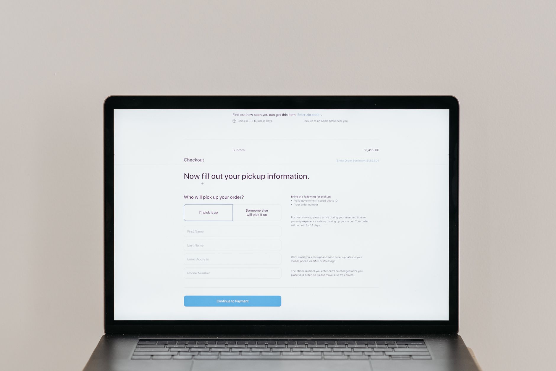
- Short forms: ask only for the fields strictly necessary at the first step of the journey
- Controlled load speed: an LCP under 2.5 seconds remains the benchmark, and every extra second measurably drags down mobile conversion rates
Why This Matters for Conversion
A visitor who has to pinch-zoom to read body text or who accidentally taps the wrong menu item twice in a row will leave before they ever reach your call to action. Mobile-first design removes that friction by building the interface around the constraints of a small screen from day one.
3. Micro-Interactions That Reassure (and Sell)
A micro-interaction is a subtle visual response to a user’s action: a button that shifts color slightly on hover, a green checkmark after a field is validated, a progress bar while a form is submitting. Used well, they reassure visitors that the site registered their action. Overused or poorly designed, they produce the opposite effect: a cluttered feeling that slows navigation down instead of smoothing it.
High-Impact Micro-Interactions for Conversion
- Immediate visual confirmation after adding a product to the cart
- Real-time validation of form fields (email, phone) before submission
- Progress indicators on multi-step funnels (quotes, bookings, orders)
- A clear confirmation message after booking an appointment or submitting a form
The goal of a micro-interaction isn’t to impress — it’s to eliminate doubt. A visitor who isn’t sure whether the form went through will either submit twice (creating backend confusion) or leave without converting at all.
4. Accessibility and Eco-Design: The New Quality Bar
Web accessibility (WCAG compliance) is no longer treated as an option reserved for certain sectors — it’s becoming an expected quality standard, on par with security or load speed. An accessible site benefits every visitor: sufficient color contrast, readable text, keyboard navigation, and a coherent heading structure. This rigor has a direct side effect on SEO: clean, semantic HTML structure is also exactly what search engines and generative AI systems understand best.
Why Accessibility Also Improves Your Rankings
Clear markup — properly nested headings, alt text on images, sufficient contrast — makes the work of crawlers just as easy as it does for users with disabilities. Add eco-design on top: reducing image weight, cutting unnecessary scripts and external fonts lightens pages, which mechanically improves Core Web Vitals and, in turn, organic rankings.
Accessibility in 2026 is also a legal requirement in many regions, with real financial penalties for non-compliance. Building accessibility in from the start is cheaper and faster than retrofitting it after a site launches.
5. Conversational AI: Simplify Without Adding Friction
Conversational assistants (chatbots, AI agents) are becoming standard on showcase sites in 2026, but their usefulness depends entirely on how they’re integrated. A chatbot that genuinely answers frequent questions — pricing, timelines, availability — reduces friction and speeds up decisions. A poorly calibrated chatbot that interrupts browsing or systematically redirects to a contact form does the opposite, driving the bounce rate up.
The rule to remember: AI should remove a step for the visitor, never add one.
Examples of AI Done Right
- An agent that answers “What are your opening hours?” instantly without requiring the user to fill out a form
- A product recommendation bot that filters options based on two or three natural-language questions
- A booking assistant that checks availability in real time and lets the user confirm a time slot in the same conversation
Examples of AI Done Wrong
- A popup chatbot that opens automatically 5 seconds after every page load, interrupting reading
- A bot that asks for your email address before answering any question
- An assistant that claims to answer questions but always ends with “please contact our team” instead of providing an answer
Real-World Examples: Where These Trends Show Measurable Impact
Case: Local service business (plumbing, HVAC)
A plumbing company redesigned their homepage around functional minimalism: one goal (call now), one CTA button visible in three places (hero, midpage, footer), and a mobile-first layout with a tap-to-call button always accessible. Their mobile conversion rate went from 2.1% to 4.7% within six weeks, with no change to their ad spend.
Case: E-commerce (fashion accessories)
An online accessories store replaced their homepage carousel (averaging 1.3% click-through) with a static hero image and a single “Shop Now” button. They added real-time form validation on the checkout page and a progress indicator for the three-step funnel. Abandoned cart rate dropped from 68% to 51%, directly tied to reduced checkout friction.
Case: SaaS landing page (B2B tool)
A B2B SaaS company rebuilt their pricing page with accessibility as a core requirement: improved color contrast, semantic heading structure, and keyboard navigation. As a side effect, their organic rankings for comparison queries (“Tool A vs Tool B”) improved by an average of 8 positions, which they traced back to better on-page structure legibility for crawlers.
FAQ: Common Questions About UX Trends and Conversion
Does a minimalist design hurt branding?
Not if it’s functional minimalism rather than aesthetic minimalism. Your brand identity (colors, fonts, tone) stays intact — you’re just removing interface elements that don’t serve the user’s goal. Strong branding and clean interface design are not in conflict.
How do I know if my site is truly mobile-first?
Check your mobile Core Web Vitals in Google Search Console. If your mobile LCP is above 2.5 seconds, your mobile INP is above 200ms, or your mobile CLS is above 0.1, your site was likely not designed mobile-first and is suffering from desktop-to-mobile adaptation issues.
Can I measure the ROI of accessibility improvements?
Yes, through multiple lenses: compliance risk reduction (avoiding fines), organic ranking improvement (cleaner HTML helps crawlers), and conversion rate lift (better usability benefits all users). Track before-and-after conversion rate, bounce rate, and time-on-page after implementing WCAG fixes.
Should I add a chatbot if my site already has a contact form?
Only if the chatbot can answer common pre-contact questions without requiring the user to submit the form. If it’s just another way to collect an email address, skip it — it adds friction rather than removing it.
What to Take Away for Your Showcase Site
The UX trends that genuinely matter in 2026 aren’t stylistic effects — they’re structural choices that reduce the friction between a visitor’s arrival and their decision to act. Functional minimalism, mobile-first design, useful micro-interactions, accessibility, and well-calibrated AI form a coherent foundation that applies to most showcase sites, regardless of industry.
To find out exactly where your site stands on these five criteria and identify the friction points holding your conversions back, the team at seoforge.io offers a full audit combining technical SEO analysis with user experience review — a solid starting point for turning a “nice-looking” site into one that actually converts.